The Tamla Motown label is an iconic record label that was founded in 1959 – initially just ‘Tamla Records’ before the Motown (‘motor town’) part was added later that year – in Detroit, Michigan. The label was known for producing some of the most popular and influential music of the 1960s and 1970s, including hits by artists such as Stevie Wonder, Diana Ross and The Supremes and Marvin Gaye.
One of the distinctive features of Tamla Motown records was their use of the colours yellow and maroon on their labels. But why did they settle on this colour scheme? As a pop artist whose art subject is music and pop culture icons, I explore the origins of Tamla’s colour palette below.
The Tamla Motown record label used a yellow and maroon scheme for branding purposes. Berry Gordy, Tamla Motown founder, chose warm, vibrant colours that would stand out on record store shelves. The colours also evoke energy, excitement and optimism, reflecting the label’s upbeat, soulful music.
Read on to learn more about the reasons why a yellow and maroon colour scheme was chosen. I also explore colour psychology and what these colours are said to represent.


The Tamla Motown record label used a colour scheme of yellow and maroon primarily for branding and recognition purposes. According to Berry Gordy, the founder of the Tamla Motown label, he chose the colours based on his personal preference for warm, vibrant colours that would stand out on record store shelves. In addition, the colours were meant to evoke a sense of energy, excitement and optimism that reflected the upbeat, soulful music that the label was known for.
The yellow and maroon colours were also used to differentiate Tamla Motown records from those of other labels. At the time, many record labels used a standard black and white label design, which could be difficult for consumers to distinguish from one another. By using bright, distinctive colours, Tamla Motown made their records easily recognisable and helped to create a strong brand identity.

Another possible reason for the choice of colours is that they may have had symbolic meanings for the African-American community. In some African cultures, yellow is associated with joy, happiness and hope, while maroon represents strength, courage and determination. By using these colours, Tamla Motown may have been sending a message of pride, empowerment and resilience to its primarily African-American audience.
Overall, the choice of yellow and maroon for the Tamla Motown label was a deliberate and strategic decision that helped to create a distinctive visual identity for the label and its artists. These colours continue to be associated with the classic Motown sound and remain an enduring symbol of one of the most influential and beloved eras in popular music history.


Colour has played a significant role in record label design since the early days of the music industry. Labels often used colour to help distinguish their products from those of their competitors and to attract attention from record buyers. In some cases, colours were used to convey certain messages or associations that were relevant to the label’s branding or musical style.
Tamla Records was no exception to this trend. The label’s use of yellow and maroon was carefully chosen to help it stand out in a crowded marketplace. The bright yellow label with bold black lettering was eye-catching and easily recognisable, while the deep maroon colour of the logo added a touch of sophistication and elegance.
In addition to their visual impact, the colours of the Tamla Records label also had symbolic significance. Yellow has long been associated with optimism, positivity and happiness, which was fitting for a label that specialised in upbeat and danceable music. Maroon, on the other hand, is a deep, rich colour that is often associated with luxury, royalty and elegance. This helped to reinforce the label’s image as a purveyor of high-quality, sophisticated soul music.

Tamla Records’ use of yellow and maroon has left a lasting impact on popular culture. The label’s bold, colourful design helped to establish it as a leader in the soul music genre and paved the way for other record labels to experiment with new and innovative designs. The label’s distinctive colour scheme has also been the subject of numerous tributes and homages over the years.
One notable example of this is the album cover for Prince’s 1984 album “Purple Rain.”The cover features a striking image of Prince in a purple outfit, set against a background of yellow and maroon clouds. The use of these colours is thought to be a nod to Tamla Records’ iconic colour scheme and helped to establish Prince as a worthy heir to the soul music legacy of Motown and Tamla Records. I’ve also written a similar blog post on the fascinating symbolism of Prince and purple – read this here.


In conclusion, the colours of the Tamla Records label were not chosen at random, but rather were carefully selected to convey a specific message and image. The combination of yellow and maroon helped the label to stand out in a crowded marketplace and reinforced its image as a purveyor of high-quality, sophisticated soul music.
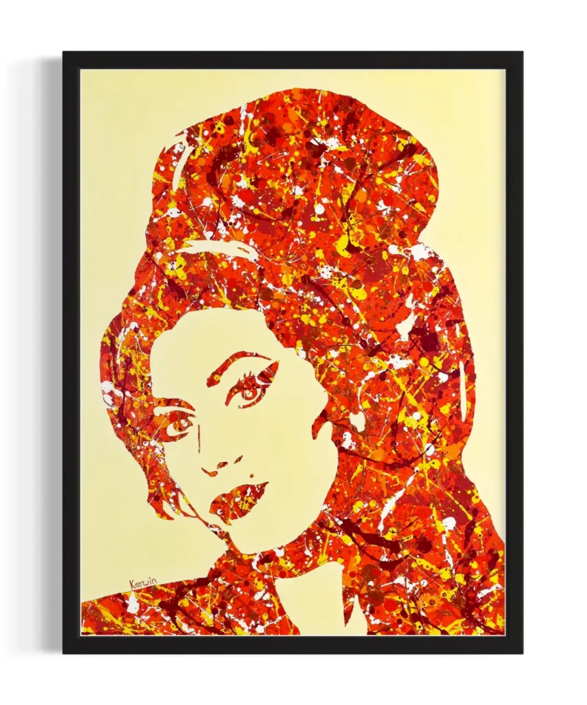
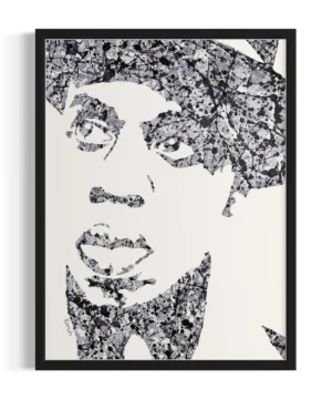
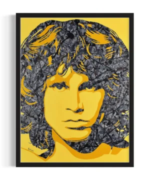
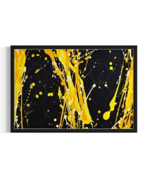
The legacy of Tamla Records’ colour scheme can still be felt today in the countless homages and tributes that have been paid to it over the years. One of these tributes is my Marvin Gaye pop art painting, painted in 2021 in my signature Jackson Pollock-inspired style.


When I decided to paint the soulful singer I knew I needed – like Tamla Records – a colour palette that would reflect Marvin Gaye’s warmth and spirit. After playing around with a few ideas I felt maroon would be fitting, and after reading about the history of Tamla Motown I knew that emulating their maroon and yellow combination would be a perfect match.
Watch the video of my Marvin Gaye painting below!
View my Marvin Gaye painting here – where you can also buy a print in various sizes between £35 – £75.
Can you think of any other examples where colour is used to represent a particular style of music?
I also recorded a drawing tutorial video during the process of creating my Marvin Gaye painting, with some tips to help improve anyone’s drawing ability. Watch this at the bottom of the page and let me know if you found it helpful!
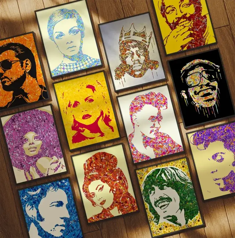
View my full range of Jackson Pollock-inspired pop art paintings and prints of your favourite music and pop culture icons at www.bykerwin.com. High-definition printing, fast worldwide delivery and satisfaction guaranteed. You can follow my art progress on Instagram and Facebook.
Read my other blog posts about how art and music interact, here.