In the wake of the sombre post-war years in the mid-20th century, a vibrant revolution known as Pop Art erupted onto the global art stage, igniting a visual and cultural explosion that continues to captivate audiences today. Born in the 1950s and reaching its zenith in the 1960s, Pop Art defied conventions, turning its gaze toward the ordinary and often mundane elements of popular culture.
A cornerstone of this artistic phenomenon was its audacious use of colour – with Pop Art typically created in an electrifying and vibrant colour palette. Pop Art soon became associated with colour schemes that not only challenged artistic norms but also served as a dynamic reflection of the growing optimism of this era.
Pop Art often uses vivid primary colours such as red, blue and yellow, along with high-contrast combinations. These hues reflect the movement’s aim to embrace consumer culture and create art full of energy and modernity. These vibrant colours grab attention and challenge traditional artistic norms.
As a UK Pop Artist who paints music’s biggest icons in my own bright colour schemes, below I embark on a journey through the kaleidoscopic world of Pop Art’s colours. I explore the profound meanings behind its vibrant hues and shed light on some of the techniques, from Andy Warhol to Roy Lichtenstein, that birthed an entirely new art aesthetic.


Emerging as a vibrant response to the sombre post-war years, Pop Art burst onto the art scene during the 1950s and 1960s. It defied tradition, celebrating the ordinary and challenging the boundaries of artistic expression. Central to its visual language was a dynamic colour palette that captured the spirit of the era, creating artworks that resonated with a broad audience.
Interesting Fact: The term “Pop Art” was first coined by British curator Lawrence Alloway in 1954, emphasising its connection to popular culture and mass media. A previous term for this style of work was “Propaganda Art”, due to Pop Art’s intentions to convey clear, and often consumerist or political, messages through its work.
The vivid explosion of colours in Pop Art was a deliberate departure from the subdued tones that dominated the art world. As society grappled with the rise of consumerism and mass media, Pop Artists sought to mirror this sensory overload through their use of intense and vibrant colours. This deliberate choice was not only a visual rebellion but also a reflection of the rapid societal changes taking place.
Pop Art primarily uses vivid primary colours such as red, blue, and yellow, along with high-contrast combinations. These hues reflected the movement’s aim to embrace mass media and consumer culture and its visually striking nature. These colour palettes resulted in artworks that resonate with energy and modernity. By employing these vibrant colours, Pop Art not only grabs attention but also critiques the saturation of consumerism and challenges traditional artistic norms.
Interesting Fact: The emergence of new and affordable acrylic paints played a crucial role in allowing Pop Artists to explore a broader spectrum of colours, contributing to the movement’s bold aesthetic.


The invention of acrylic paints around the 1940s marked a pivotal moment in the world of art. Unlike traditional oil paints, acrylics offered artists a revolutionary medium that combined the best of both worlds – quick drying times akin to watercolours and the vivid pigmentation of oils.
The first version of acrylic paint, an acrylic resin dispersion, was used as early as 1934, having been invented by Otto Röhm and developed by a German chemicals company. A spirit solution-based acrylic paint was manufactured between 1946-1949 by Leonard Bocour and Sam Golden, through their brand Magna Paint. Water-based acrylic paints, which are the common type we know today, soon followed.
This newfound versatility of paint allowed artists to experiment with colours and techniques in ways previously unattainable. As Pop Art emerged on the scene, the advent of acrylic paints became a catalyst for the movement’s bold and exuberant use of colour.
With acrylics’ fast-drying nature, Pop Artists could rapidly layer, blend, and juxtapose colours, enabling them to capture the intensity of consumer culture and the vibrancy of mass media imagery.
This innovative medium resonated with the movement’s desire to mirror the immediacy of the era, resulting in artworks that pulsated with energy and unabashedly embraced the vivid colour spectrum that came to define Pop Art’s iconic aesthetic.


Roy Lichtenstein, a pioneer of Pop Art, adopted a distinctive colour scheme in his early days, centred around primary colours: red, blue, yellow, and black. These colours became iconic identifiers of the movement, capturing the essence of commercial imagery. Lichtenstein’s masterful use of Ben-Day dots, a technique borrowed from comic books, allowed him to create complex images using minimal colours while maintaining a visually striking impact.
Lichtenstein created gradients and lighter shades by positioning different coloured dots close together (eg, positioned blue dots on a white background to create the effect of light blue). Read my blog point on Pointillism and how Ben-Day dots created an optical illusion of colour within Pop Art here. Lichtenstein did also adopt other colours later in his career (such as below), while sticking to his principle of a limited colour palette.
Interesting Fact: Lichtenstein’s fascination with primary colours was partly influenced by his background in commercial art, where vibrant hues were commonly used to catch the consumer’s eye. (Since the beginning of the movement, Pop Art has typically been created with commercial intentions – often to much criticism from the traditional art world.)

The incorporation of primary colours in Pop Art serves a dual purpose: visual appeal and emotional resonance. Red, blue, and yellow are the building blocks of colour theory, holding a universal allure that transcends cultural boundaries. This universality ensured that Pop Art’s message reached a diverse audience, aligning with the movement’s goal of making art accessible to all.
Moreover, primary colours evoke powerful emotions, contributing to the immediate impact of Pop Art.
Interesting Fact: Primary colours are not only significant in art but also play a fundamental role in various fields, such as additive colour mixing in digital displays.
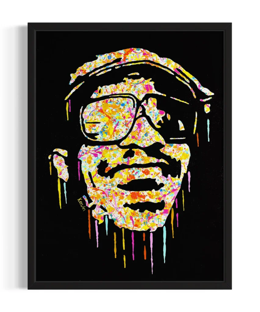
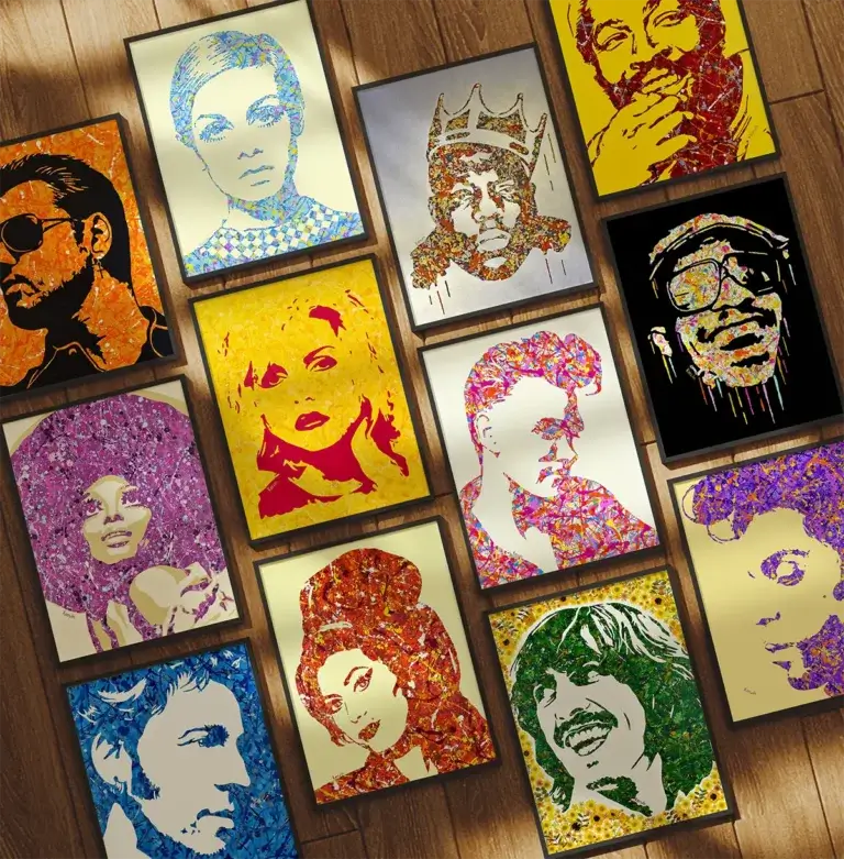
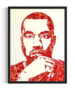
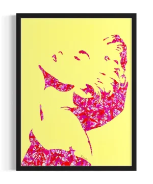
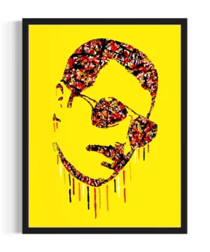
My own range of By Kerwin Pop Art acrylic paintings features a vibrant and diverse colour palette. Explore my full range of colourful paintings and shop prints from my online shop.

Andy Warhol, an influential figure in the Pop Art movement, employed colours in ways that were uniquely his own. His iconic portraits of Marilyn Monroe, rendered in bold and vibrant hues, captured both her celebrity status and the complex layers beneath. Warhol’s fascination with colour extended to his Factory studio, where he often used bright, unconventional shades to create an atmosphere of creative innovation.
Interesting Fact: Warhol’s studio, The Factory, was not only a space for artistic production but also a hub for social interactions, blurring the lines between art and life. It was in his studio that we met and collaborated with many figures from the world of music – read about how he designed some iconic album covers, here.

Contrast was a defining element within Pop Art, and the strategic use of contrasting colours heightened its visual impact. By pairing complementary colours – those situated opposite each other on the colour wheel – artists created a dynamic tension that amplified the vibrancy of their works. This interplay of colours served as a metaphor for the collision between consumer culture and individual expression.
Interesting Fact: The concept of complementary colours dates back to Sir Isaac Newton’s studies of colour perception in the 17th century, adding a historical layer to their significance in art.
I’ve written about how the use of complementary colours can help you design your home decor and match your wall art to your furniture. Read this here!


The exuberant colour palette of Pop Art was not just a stylistic choice; it was deeply intertwined with the cultural and social context of the time. The movement emerged against a backdrop of significant historical events, such as the Civil Rights Movement, the Space Race, and the counterculture revolution.
These societal shifts and the visual bombardment of advertisements led Pop Artists to embrace bright colours as a means of capturing the energy, optimism, and complexity of this era.
Interesting Fact: Pop Art’s vibrant colours often mirrored the vivid aesthetics of everyday consumer products, creating a seamless integration of art and life.
[SUPERMARKET PHOTO] Pop Art often drew colour inspiration from supermarket shelves and everyday consumer goods in the 1950s and 1960s. Bright colours helped their work stand out!
While often associated with paintings, Pop Art’s use of colour extended to three-dimensional sculptures as well. Artists like Claes Oldenburg and Tom Wesselmann crafted sculptures that replicated everyday objects, applying the movement’s signature colour palette to these larger-than-life creations. These sculptures brought an interactive and immersive dimension to Pop Art, blurring the line between art and reality.
Interesting Fact: Claes Oldenburg’s “Spoonbridge and Cherry” sculpture in the Minneapolis Sculpture Garden is a prime example of how Pop Art’s colourful aesthetics can transform public spaces.

Pop Art’s vibrant colour palette continues to influence contemporary artists, transcending its origins to shape new artistic expressions. Contemporary creators (such as my own style of Pop Art action painting draw inspiration from Pop Art’s bold hues and innovative use of colour contrast, infusing these elements with modern sensibilities. This legacy serves as a testament to the enduring impact of the movement on the art world.
My own range of By Kerwin Pop Art acrylic paintings features a vibrant and diverse colour palette. Explore my full range of colourful paintings and shop prints from my online shop.
Interesting Fact: Renowned contemporary artist Jeff Koons is known for his oversized, colourful sculptures that evoke the spirit of Pop Art while addressing themes of consumer culture and materialism.


In the captivating world of Pop Art, colours functioned as more than mere visual elements –they were powerful tools that conveyed cultural shifts, emotions, and societal commentary. Through a masterful manipulation of colour, Pop Artists immortalised an era of change, paving the way for a movement that would forever redefine the relationship between art, society, and colour itself.
As we continue to marvel at the brilliance of Pop Art, its vibrant palette serves as a vivid reminder of its ability to captivate, provoke, and inspire.
What is your favourite colour? Are you a fan of Pop Art’s use of bold and simple colour schemes?
Read my blog post on what inspired the Pop Art movement in the 1950s, here. I also have a whole blog section on Pop Art – explore this here.

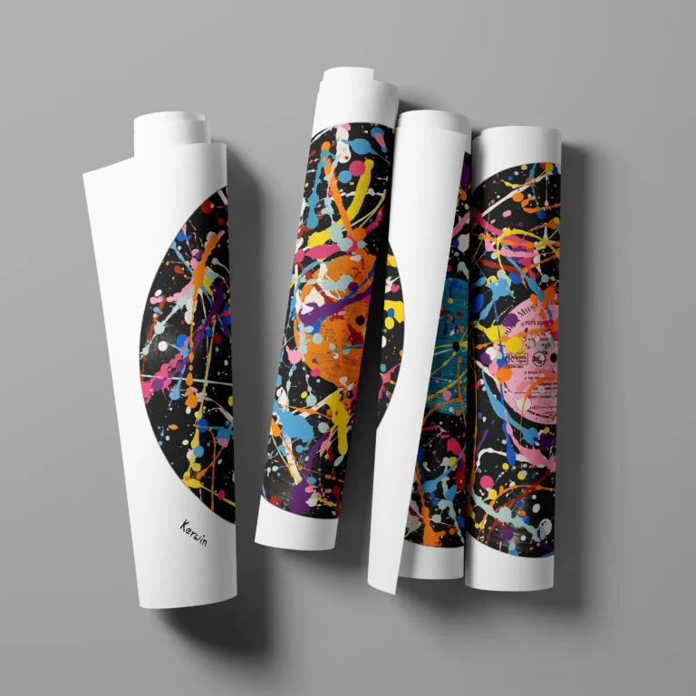
View my full range of Jackson Pollock-inspired pop art paintings and prints of your favourite music and pop culture icons at www.bykerwin.com. High-definition printing, fast worldwide delivery and satisfaction guaranteed. You can follow my art progress on Instagram and Facebook.